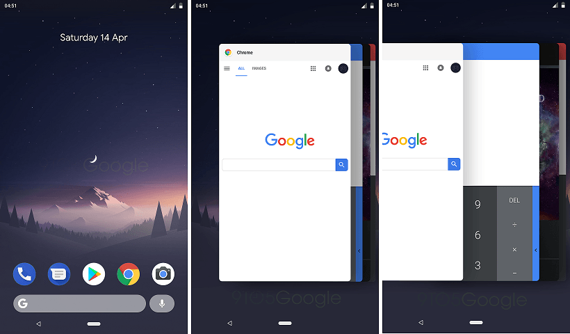
Back when the unveiling of Android operating system in 2007, there were a total of four navigation buttons, including “Back”, “Home”, “Overview” (the app switcher) and “Search”. Then, it shrunk to only three without the dedicated search button. According to information from 9to5Google, Google is going to overhaul the design entire navigation UI in the upcoming Android P update.
To accommodate the increased popularity of smartphone with 18:9 “full screen” displays, the new navigation bar will be further simplify. The “Overview” button will be completely removed, while the “Back” button remained unchanged. The “Home” button will be altered from circle to long pill-shaped, similar to what Apple does in the new iPhone X. However, it will have additional gesture controls. For now, we know that the new home button can not only act as the original one with a tap to the home screen, long press to call the Google Assistant, but can also switch up to access the multitasking screen.
Speaking of the multitasking screen in Android P, the existing vertically stacked application cards are switched to horizontally stacked, similar to iOS. You can swipe left to show more apps or swipe up to close the apps.
The actual design of the new navigation bar may change from version to version, as Android P still has a long way before the official release (approximately in October 2018). For more information, you can check out 9to5Google’s article.
Feel free to leave comments below, if you have any opinion about this website. Share the website around if you enjoy reading it. Subscribe to our Newsletter or follow our Google+, Facebook and Twitter.
Support this website simply by shopping in Amazon. It will give us small kickbacks, if you use the above affiliate links to make any purchases, which will help us grow.


